
Warm tones, like earthy browns, soft yellows, and cozy oranges, have a profound impact on how we experience architectural spaces.These hues are more than just color choices—they evoke emotional responses that shape the way we feel, live, and interact within a space.

Psychologically, warm tones are associated with comfort, intimacy, and relaxation. They mimic the colors of nature, like the setting sun or autumn leaves, which can create a sense of grounding and stability.
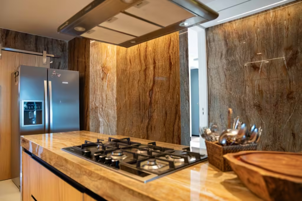
In architecture, these tones foster a welcoming and inviting atmosphere, ideal for spaces designed for social interaction, such as living rooms, dining areas, and hospitality environments.
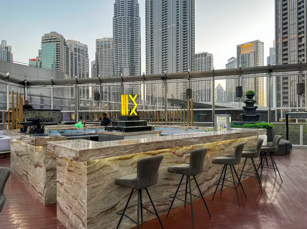
Warm colors can also influence our perception of temperature and space. For instance, they tend to make rooms feel cozier, creating a snug ambiance even in larger areas. This makes them ideal for spaces in cooler climates or where a feeling of warmth is desired.
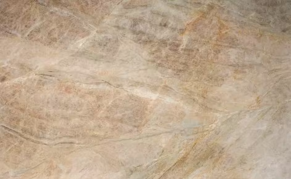
Here is a great quartzite on this hue.
[…] Warm hues in Architecture design […]